Dropdowns (or select boxes) are an easy way to implement a considerable list of options in a small amount of space. A typical use would be a list of countries, or a list of years.
But using a dropdown for fewer than 5 items seems an overkill.
Consider this interface element in iTunes:

Using a dropdown requires clicking the dropdown and navigating in a defined (and sometimes narrow) area. It also hides the options from the user until he actually clicks it.
Considering the amount of space surrounding the dropdown, and the few number of options available, I’d suggest using that space to display the 3 options directly.

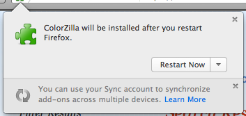
Firefox also makes use of a dropdown in a 2-options context:

This implementation is actually more prone to errors: you can accidentally restart your browser while trying not to. Some Windows security or antivirus updates often make the same mistake (and unwillingly restarting your computer is much more infuriating than just your browser).
I guess Firefox could have used the dialog box space to display the ‘Not now’ option:

It doesn’t look like a big issue after all, but it’s the kind of small details of UX that tend to be overlooked (or overthought) and could be easily fixed for the sake of clarity (in terms of information and usability).