CSS provides several size units:
pxpixels%percentagesemrelative to the font sizeremrelative to the root font size- even unitless values (for
line-height)
The most natural unit to use is pixels, especially for defining height and width, as it’s an absolute unit.
But relative units, like em, have their benefits as well.
How em works
em is relative to the current font-size value. So if your element has font-size: 12px, 1em equals 12px.
By defining your font-size, you can use em to define relative values for other properties:
marginpaddingheightwidth- etc.
rem acts exactly like em. The only difference is that while em refers to the element’s font-size value, rem refers to the root’s font-size, which is the <html> element.
By updating a single font-size value, you can update other properties:
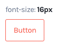
.button {
  font-size: 16px;
  padding: 0.75em 1em;
}
So you can simply define different button sizes by only altering the font-size:
.button--small {
  font-size: 12px;
}

.button--large {
  font-size: 20px;
}
Why you should use px, not em
Using em is a very elegant way to define both your text size and your layout. It keeps every element balanced and easily sizable. I’ve used it before. It’s a pain.
Fonts need precision to look sharp
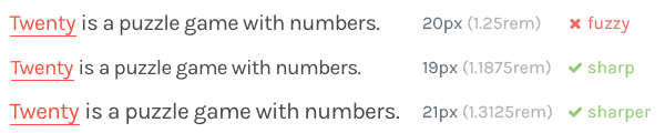
Let’s say your default font-size is set to 16px. You have titles at 2rem and subtitles at 1.5rem. Fabulous! Your semantic hierarchy matches your visual one. If you were to change your default text size to 15px, you’d maintain that hierarchy.
But not all font sizes are equal… Considering the text of this website:
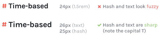
Even with bigger text, the problem is present:
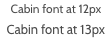
Every font needs its own specific size
Another problem with em arises when you want to change the font family, because every font renders differently at each size:
Images need pixels
An image’s dimensions are set in pixels. If you want to vertically align its surrounding text precisely, you need to use a padding-top and a line-height in pixels:
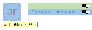
(My logo isn’t an image but it used to be, and they usually are anyway).
Borders need pixels
Let’s say you want your buttons and inputs to be 38px high. Having both equally sized allows to put them next to each other, like in Bootstrap 4:

How do you that with rem?
.form-control {
  border: .0625rem solid #ccc;
  border-radius: .25rem;
  font-size: 1rem;
  padding: .375rem .75rem;
}
All these calculations are based upon a font size of 16px. Now let’s say you have to change that value, like 15px, what happens?

Yep. The border is now set at 0.9375px, and just disappears, rightfully so.
You would think: “Why not use an inset box-shadow?”? Well box-shadow is not the solution:
- every time you want to add a shadow, you need to redefine all other values
- the shadow is not part of the box model
- it can only be a single colour
- you need 4 shadows if you want 4 different “border” colours
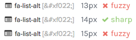
Vectors need pixels
Vector elements, like icon fonts need precise pixel values to render correctly.
The default font size for Font Awesome is 28px. If you need smaller icons, stick to 14px. Any other value would look terrible:
Browsers zoom properly now
Browsers used to zoom in a page by simply increasing the font size, making the text bigger but keeping the layout set in pixels at its initial size. To prevent users from breaking the page when zooming in, you had to define a fluid layout, using em or rem.
But nowadays, browsers can simply zoom any layout proportionally. No need for em anymore.
Just use pixels
If you want sharp precise interfaces, stick to px:
- you’ll avoid any cumbersome calculations that involve 4 decimals
- just by looking at a CSS rule, you’ll know exactly how it will look like because there’s no dependency
- preprocessors like Sass allow easy maintenance anyway: you can have global variables for sizes, or use mixins to define variations for your elements
- you’ll be able to align different types of elements that each require their own
font-size
You can still use em for things like letter-spacing, some margins, or any property that can be applied on different font-size values. But any reason to apply em everywhere is either outdated or futile.