Ever since Google launched its redesign, I’ve been wanting to point out a design direction that many websites seem to take: killing colors.
Amazon


GMail

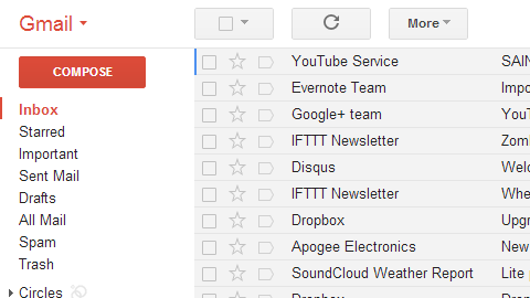
GCalendar


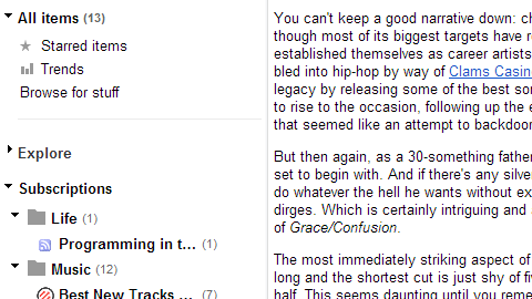
GReader

WordPress


Digg


Are the newer versions prettier? That’s for you to decide. But overall, they seem to lack depth and hierarchy.
I actually loved the Digg V3 design and it inspired some of my work. Many colors were involved but they were complementary and appealing, and the spacing was perfect. And I was able to recognize the website right away, and not take a second to wonder ‘Is this the good one?’.
Concerning GMail, I don’t know if it’s the cheap-looking buttons (that really look like a web designer’s first encounter with CSS3 border-radius and gradients) or the lack of depth the page holds, but it really doesn’t captivate me much. I remember Doug Bowman’s work on recreating the GMail buttons in 2009. A lot of thought went in the process, and it showed. The buttons felt like buttons. They were easy to read and easy to spot. (By the way, I loved Stop Design’s previous layout).
A lot of the websites mentioned are actually apps. Maybe avoiding colors is a design’s silent protagonist: it helps the user identify itself with the website. No color, no obvious identity, just you and the app.
But even Apple seems to be heading towards that direction.
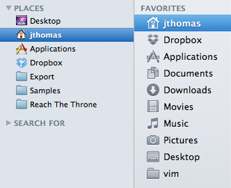
Like gradients and shadows, it’s easier to mess up a color palette than sticking to greyscale. Compared to the 16,777,216 hexadecimal codes available, 256 shades of grey is quite fewer parameters to handle but you can’t really do much with them.
Choosing grey is actually not choosing.
Maybe it’s a fear of committing your design to a real identity.
Maybe it’s a well-thought decision to offer a clean layout.
Maybe it’s just easier.
Or maybe it’s just a trend. I honestly hope it is.