It’s a common thing among designers to provide a so-called “unsolicited redesign” of a well-known website and write about it. Here’s my humble attempt.

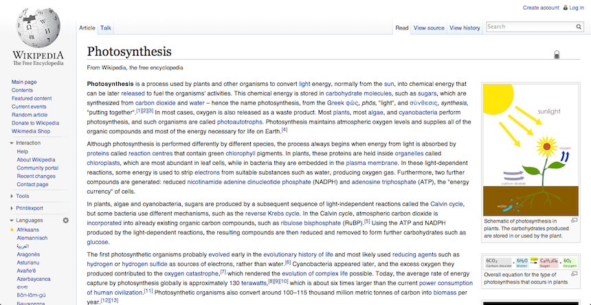
As you would have figured, it’s just a screenshot. I didn’t change anything because there is nothing to change. Or at least, not enough to prompt a complete graphical overhaul.
“It’s about content, stupid!”
Wikipedia is probably my favourite website. I like to imagine it as the epitome of Sir Tim Berners-Lee’s vision when he created the Web: a collaborative tool to gather and share knowledge freely.
An open encyclopedia? Accessible online for free? But most importantly, editable by anyone? “That’s crazy, it’s never gonna work.” The ability to easily insert false information embodies the usual criticism you would encounter, but actually acts like a fraudulent proof-of-concept of Wikipedia’s doomed premise. The thing is, there is in the long run no incentive to alter Wikipedia’s content and degrade its integrity. The collaborative authority will prevent it anyway.
As a result, Wikipedia’s main, and sole, purpose is to deliver content. It’s a database of information, 95% of which is text, the not coincidentally “T” in HTML.
The TL;DR of the links it references
You usually don’t read Wikipedia: you scan it. Well, it is a website, and with it comes the usual browsing behavior. Any redesign that crushes the information density is missing the primary use case: looking for a specific bit of information in a well-structured page full of text. It’s a starting point that provides a condensed overview.
There are studies about how each line of text shouldn’t exceed 70-80 characters. I hope Wikipedia never blindly sticks to that rule. I want the data, the text, the hyperlinks, the sidebar summary, the hierarchy in the layout.
And whenever I do read a page in full, the design never bothered me. I actually didn’t see the design. I wasn’t aware of it. And that’s actually the point.
The “fairy tale” mockup
You’ve seen it in all redesigns already:
- the Facebook news feed with gorgeous friends pictures
- the ad-less IMDB
- the content-curated Wikipedia page
- the huge screen/no border iPhone concept
- the image-heavy “2560x1440 optimized” airline website

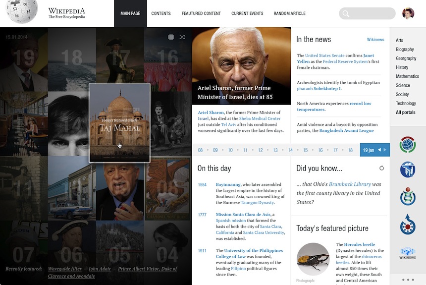
In the latest Wikipedia redesign concept, the homepage uses a grid of high-quality images as its primary content. Why high-quality? Well, they’re mostly pictures, either aesthethically pleasing or immediately identifiable. It’s easy to dismiss the text when choosing pictures/paintings of Steve Jobs, Virgina Woolf, Horatio Nelson, Nelson Mandela, Henri VIII…
I guess Wikipedia mention them every month, right? What about the content that’s on Wikipedia right now?


Sure, let’s drop the substance, or alter it enough to fit our needs. It works for me, in my context, on my screen, it should be fine, right? Well, that’s not designing. That’s cheating. You’re skewing the content’s use, perverting its value.
I wouldn’t hire you
So you wanted to show off your Photoshop skills? And you chose one of the top 5 websites? Surely nobody thought about it (both the project choice and actually redesigning Wikipedia).
Why Wikipedia? Because you often stumbled upon it and thought “Urgh, it’s so ugly!”? If so, you weren’t using it. You were looking at it. That usually happens with clients and their feedback. And it’s tiring.
I understand you want to build a stunning visual portfolio, and relying upon a familiar brand will trigger a better (or bigger at least) response.
But you’re missing the point of designing websites. And if you provide a Wikipedia redesign only to dismiss everything that made its success, and insert your own version of Dribbble’s latest trends, then you’re probably not worth hiring because you’re incapable of analyzing the core purpose of a project and tackling real-world problems.
Want some UI ideas? Make a todo app, a weather widget, I don’t care. It’s overdone, but at least you can focus on the eye-candy without killing the purpose.
And don’t call yourself a UX designer. You probably don’t know anything about UX. I know I don’t. Changing the color of a button to attract the eye is not UX. Whitespace is not UX. Oh, and not distinguishing visited from non-visited links is definitely bad UX.
So yeah, I wouldn’t hire you. But what do I know? I’m just a designer.