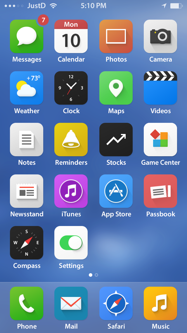
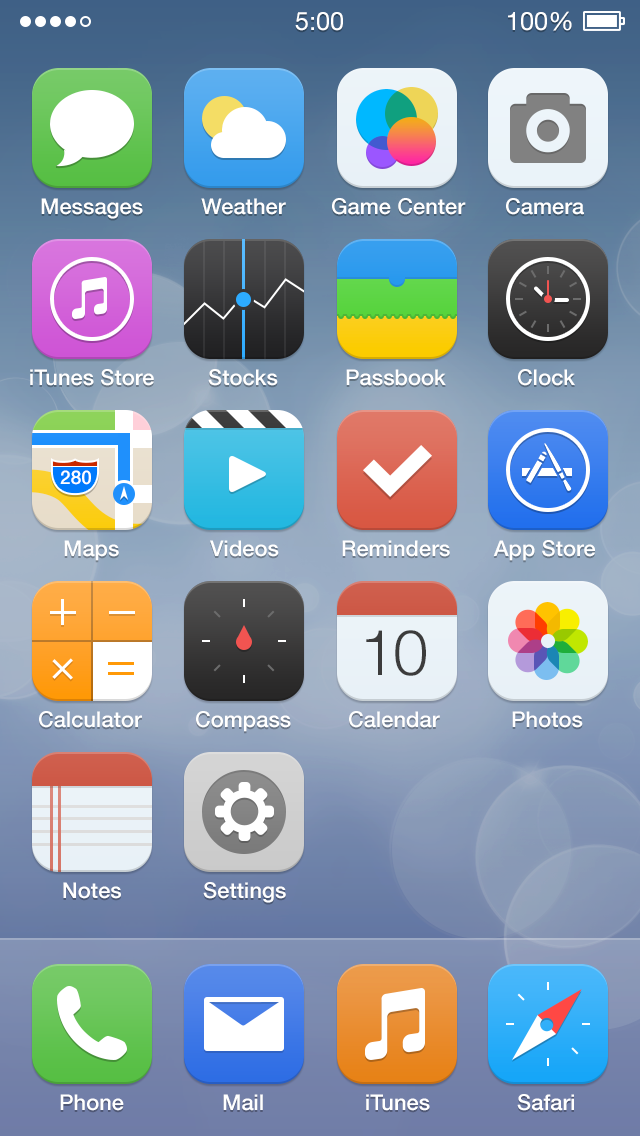
The new iOS 7 icons made most (if not all) designers cringe. They don’t criticize the decision to head for a flatter (but not completely flat) layout but rather the execution. The acid unpleasant visual result is probably due to the fact that Jony Ive put Apple’s marketing team in charge of iOS 7 icon design.
Each team in a large company has a different single goal. Marketing needs to sell, developers need to make things work, designers to make things beautiful and usable. If 2 of these goals are assigned to the same team, there is a purpose conflict. You can not refine one aspect of your work without the fear of damaging the other. So you end up in a grey area where none of your 2 goals is completely fulfilled.
iOS 7 is still in beta, so there’s still time to polish the shipped product, and it’ll probably happen:
The look and feel of the icons and other new UI bits are likely to change significantly as the iOS 7 beta proceeds.
After Apple unveiled the new iOS 7 design, I headed for Dribbble because I knew designers would rapidly come up with dozens of alternatives, which ultimately turn out as more than decent solutions to a real issue.
iOS 7 is a big disruption in Apple’s interface history. It can be a big leap forward as long as refinements are made. We weren’t used to Apple shipping a half-baked product. Luckily there’s still time to polish it and respond to the collective roar of the design community, though historically large companies seldom alter their decision based on people’s discontent (Xbox One?).

