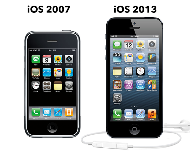
I must say, I was very surprised by Apple’s iOS 7 unveiling. I’m a designer (though not a great one) so I’m usually first concerned about how it looks and my first thought was “It looks terrible.” And apparently, I’m not the only one. Of course it’s hard to have a complete valid judgment without having held an iPhone with iOS 7 in your own hands. But I remember being delighted by the first iOS’s screenshots back in 2007. It was a great start and a solid base to increment on, hence the light changes in a span of 6 years.
Gradients
I’m more concerned about the gradients. iOS 7 isn’t exactly “flat”. The icon gradients yield a subtle sense of depth. But they look clumsy. I once wrote:
Nowadays, I tend to avoid gradients because it’s so easy to mess it up. It’s not only about choosing 2 colors, it’s about eveything that happens in between.
You can obtain decent looking gradients with only 2 color stops (one on top, one on bottom), but designers usually mix several gradients or create more complex ones to achieve a much better result.
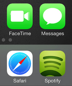
If I were to copy the Spotify icon, I’d start with a simple 2-stop gradient. But the result wouldn’t be as appealing, because there’s more involved: a light glare on top, some inner shadow, and probably other subtle elements. Even the embedded shapes have gradients and inner shadows applied to them. That’s what it takes to make a good icon.
Settling for simple (and probably easy) highly saturated gradients has seriously harmed the visual appeal of iOS 7.
- Maybe going “full flat”, with just solid colors, would have been a better choice (as I said, it’s easy to mess up gradients).
- Maybe if the white icons that cover these gradients had been incredibly designed, these gradients wouldn’t have mattered. But the icons as well look as first draft mockups. I know it because I’m very bad at designing icons and they usually end up like that.
Usability
But who cares how it looks as long as it’s easy to use?
Apart from these icon gradients, most of iOS 7 is completely flat. There’s been much (rightful) criticism towards the flat design trend that’s spreading across the web, notably for its usability issues. iOS, like the web, is interactive. So any hindrance to a user’s interaction is a usability issue. Flat elements are known to lack affordance: they fail to imply any functionality. The problem is that all elements only rely on solid colors and basic shapes to convey several (and usually not complementary) informations:
- importance (a title, a secondary element, a label, a paragraph)
- state (on/off, active/disabled, in progress…)
- capability (is it a button? a notification? an ornament?)
If you restrict yourself to only 3 simple elements (color, size, shape) to convey all information for each element of your interface, you’ll face many graphic crossovers and lack differenciation.
There’s also been some concern about the use of a thin font (Helvetica Neue Light) and its readibility. I think there isn’t much to discuss about right now because it will greatly depend on the screen’s resolution.
But what people are most concerned about in terms of usability is the Control Center.
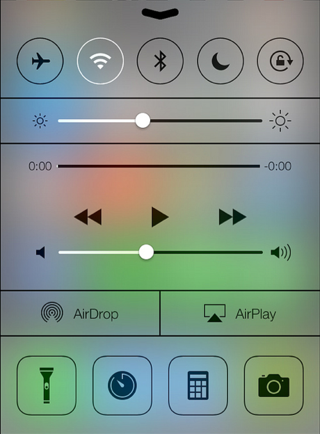
Many lines, no gradients, light shadows on the slider handles. What is interactive? What’s not?
The 5 top buttons remind me of my post about the 2 options toggle button: it’s either on or off. But does the button actually display the current state (on or off) or the possible action (turn on or turn off)? Well, the answer is within the sliders: the white part shows the current level of the lightness or volume. So I guess a top button being white means it’s on because it’s its current state.
There also may be concerns about the heavy use of thin lines to represent both progess bars, area dividers and icon borders. But I guess such a heavily used feature as the Control Center will only require a few minutes to get accustomed to.
You know good design when you use it
There’ll be many posts like mine, discussing a not yet available OS, criticizing its aspect and speculating on its usability, only to end up uttering some rapid conclusions about a software a multi-billion dollar company developed. But Apple says it best on its iOS 7 page: “You know good design when you use it”.
Oh well, it’s just a phone.