While using Chrome on Android, it occured to me its menu carried a behavior that’s recurrent in many interfaces.
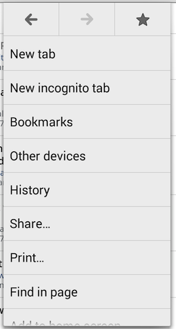
Apart from the Back, Forward, and Favourite buttons, all the other items appear identical. But apart from their visual similarity, their respective position determines their importance ; a higher position denotes a more significant role (especially when using the useful one-swipe-only interaction).
It’s therefore natural to find the ‘New tab’ button in 1st position. But the others buttons’ relative position?
New incognito tabis seldom used but is 2nd, though its position is probably due to its resemblance withNew tab- I never used
Other devicesbut it’s 4th - Same applies to
Print(7th), for which I can’t see any reasonable use case (printing a web page and via a phone?) - The more useful
Request desktop site(considering the poor state of dedicated mobile websites) is buried third to last Settingsare second to last
Re-arranging the order of these buttons is a good step towards a more usable interface.
Going further in providing a quicker and better experience, I wonder why all buttons provide the same interactive area while they don’t carry the same importance. I assume it’s due to the less error-prone touch interface. But it makes sense on desktop, especially for people not well acquainted with keyboard shortcuts:
On a side note, hiding the menu while interacting with Back and Forward is bad UX, considering they’re often used repeatedly in a row.