There was a recent post on 24ways.org that explained How to Make Your Site Look Half-Decent in Half an Hour. It was made by a programmer and aimed towards programmers. The final result wasn’t universally well received because it probably didn’t meet most programmer’s expectations. I’m a designer, and the final result didn’t appeal much to me. But still: the article wasn’t about the end result, it was about the process.
I used to work with a very talented programmer. He was comfortable with numerous languages, could build both web and desktop applications, automate tasks across different types of databases, manage our homemade servers, work on AI algorithms… It probably wasn’t that difficult for him, but he did things my mind couldn’t grasp. One day, he had to design a small interface for a tiny web app that monitored our servers. The whole point of the app was to be usable, not even good-looking. But still: he didn’t know how to design it. He asked for my help and so I threw up a quick web interface. He liked it and thanked me. I told him that it really wasn’t much and that he probably could have figured it out himself. But then he said to me: “I don’t understand graphic design. I don’t understand how you designers can come up with something so quickly. I could spend days on designing an interface and not even come close to what you did. I just don’t get your craft.” That’s when I understood how honest he was, and that he really couldn’t envision an interface, even a simple one. And that’s probably what most programmers go through.
Anyway, here’s my take on designing a site, and it’s aimed at programmers.
Bootstrap of course
It’s not a surprise that Anna Powell-Smith used Bootstrap as a foundation for her design. It’s solid, and provides interesting examples to begin with. But the real key is that it’s just code. As I’ve said before, Bootstrap defines much of its design in the HTML code. And though it doesn’t keep the dichotomy clear between HTML and CSS (one for content, one for layout), it’s easier for programmers to play around with HTML code than CSS code.
So let’s use this example as a start and tweak it.
Colors: be consistent
Probably the hardest part for programmers in designing a website is to choose colors. Although they don’t choose colors, they use them on a daily basis in their IDE, and some color schemes are really gorgeous. Actually, it’s a good resource to choose colors from because IDE colors schemes provide consistent palettes with different tints that go well together. And because programmers probably don’t use Photoshop, we’d better choose a color palette and try to stick to it.
You could browse the thousands of palettes on ColourLovers or Adobe’s Kuler but even I get overwhelmed by the quantity available. So I often stick to one of them: Solarized. This blog uses its colors, and I’ve really learned to like it because it prevents me from looking to long for decent colors. Solarized is like a designer’s Bootstrap: it’s a solid base you can use as start, and modify along the way if you want (I rarely do).
If you don’t like Solarized, try to use your favourite IDE color scheme. Or steal a color palette from a website or app you like. For example, 53’s app Paper has 4 default palettes to play around with. I particularly like the first one:

2 dark colors, 2 light colors, 2 ‘fresh’ colors, and black. Add white to it and you have 8 colors to use for different purposes.
Here, apart from the white background, I’ll use the Solarized color palette only. What’s especially useful are the 6 different tints of grey, which aren’t exactly grey but slightly blue. It’s a common design trick to use these blueish grey tints, because they’re not as boring as grey without being to prominent.
Positioning: the Holy grid
The 960 grid system is well-known among web designers. It’s supposed to provide a framework for quick prototyping, by establishing some dimension rules in a 960 pixels-wide layout. Although there now also is a 1140 grid system, the 960 one is still very relevant. And for a programmer, it can be really easy to use because it’s based around numbers. You can divide the 960 width into 12 or 16 columns, with a 20 pixels gutter. Furthermore, Bootstrap provides HTML code for a 12-columns grid system. You just need to add some classes to your divs.
For the sake of this article, I’ll leave out the responsive 1170px-wide container and stick to the 940px-wide one. One reason for that is that making your site extensible to 1170px requires to adjust some elements along the way (spacing, background images, font size) because the content will stretch out horizontally instead of vertically, and this will disturb the balance of your layout.
Size: it’s hierarchy
I like Jason Fried’s way of saying it: The Obvious, the Easy, and the Possible. Some elements should be ‘Obvious’ and stand out: the titles. They provide a quick map of the page, by defining the part they’re the heading of. Then there’s the ‘Easy’, like subtitles, navigation, forms or call-to-actions. It’s things people will read or use, but not always. Finally, there’s the ‘Possible’: all the rest, like reading the full description of a feature, or using the footer links.
For example, the logo shouldn’t be ‘Obvious’, but ‘Easy’ or even ‘Possible’ because it’s present on all pages and people know how to use it. It’s a common mistake to make the logo too big.
Colors are also meant to provide visual hierarchy, but getting the size right is 3/4 of the job. Boostrap offers 6 heading levels, plus a Hero unit for showcasing key content, and a Page header for extra emphasis.
The Hero unit used as example is already well furnished in terms of hierarchy. I’ll just tweak some font-sizes.
Fonts: not that important
I love Arial and Georgia. A sans-serif and a serif font, both considered ‘web-safe’. A programmer trying to find a nice font would be as helpless as when trying to find nice colors. Even designers like me often spend too much time in Photoshop scrolling through the hundreds of fonts they’ve installed, just to end up less certain than before.
But like with colors, you can stick to a font you’ve already seen somewhere and particularly like. If you really want a different font for your headings (and only for your headings), try Google Web Fonts’ most popular: Open Sans or Droid Sans, which are different but not outstanding.
Here I’ll just Arial. If you get it right with Arial, it’ll be easier to use a different font in the future.
Images: a great feature
If you’re building a website for your app, try to include images. Even screenshots provide a nice touch. They disrupt the ordinary visual flow that a full-text website has. For example, if you’ve hired a designer to design your logo, take the opportunity to make it stand out. Or if you’re selling an iPhone app, just use an iPhone with a screenshot.
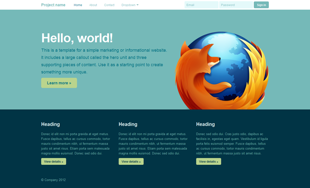
I’ll use the Firefox logo as an example. It’s big, colorful and highly detailed. It’ll add depth to the page.
Gradients and shadows: avoid them
Gradients are very hard to handle. A designer can spend hours messing around with colors just to get a gradient right. The thing is, a 2-color gradient isn’t about choosing 2 colors, it’s also about everything in between. If you add the fact that there are millions colors to choose from, the possibilities of a gradient are endless and a programmer would probably not be able to settle for one.
Shadows are quite similar. It’s mostly a 1-color gradient from opaque to transparent. The common error is to make shadows too prominent. They should provide depth without being noticable, and that’s not an easy task. It’s like adding reverb to a mix: add some until you notice it, and then lower it down.
Anyway, that’s why I don’t have gradients or shadows on this blog. I’m tired of spending hours in Photoshop just to come up with something half-decent.
In my example, I stripped out the shadows and gradients of Boostrap’s default design by overriding some background and box-shadow proprerties.
Secret: be subtle
So, if you don’t use gradients, shadows or original fonts, what’s left? Here are some details you can work on:
- Rounded corners: the border-radius CSS property is well adopted and it provides seperation between elements. It also increases the affordance on buttons (that’s why I don’t like Metro’s buttons).
- Line-height: it’s one of the details that can quickly make your website look cheap if used wrong, especially too small line-heights. But slightly too big isn’t much better. That’s why I don’t like readings Posterous blogs: the line-height is 20px for 12px size text, so the ratio is 1.66. For content, just use 1.5. For headings, 1.1 is fine. It’s easy to forget setting the heading’s line-height because they oftent have only one line of text.
- Text-shadow: this might be the only kind of shadow that can be used without too much difficulty. But still, use it scarcely. Every browser which supports text-shadow also supports rgba. So instead of putting a full white text-shadow, try to use 0 1px 0 rgba(255, 255, 255, 0.5). For dark shadows, 0 1px 2px rgba(0, 0, 0, 0.25) looks decent. Also, don’t use a dark shadow if the text it’s set upon is darker than the background. Use a light one instead (and vice-versa when the text is lighter than its background). It’s you’re not sure, don’t use it. In my example, I actually removed them.
Iterate
Even a designer won’t come up with a perfect design the first time. I’ve readjusted the design of this blog multiple times, going from a rough layout to a more consistent one. Just finish your website and consider it ‘Version 1.0’ and get some sleep. The next day you’ll notice some subtle adjustments you can make: that title is slightly too big, the spacing here isn’t right, that button lacks contrast…
Examples
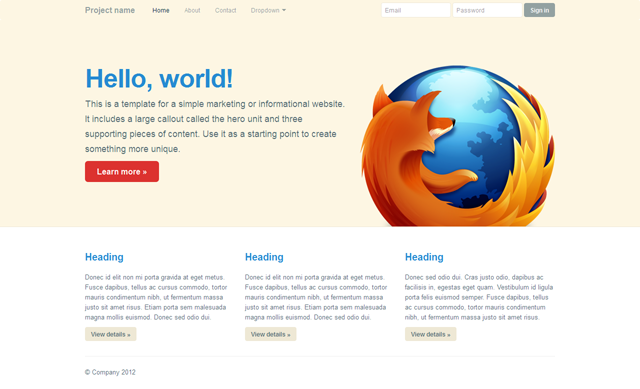
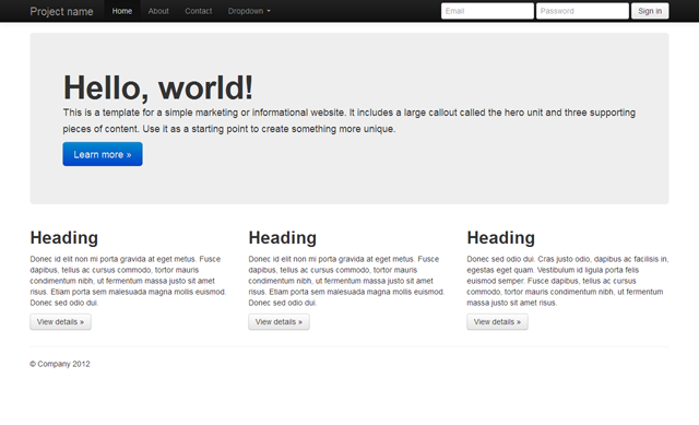
I played with Bootstrap’s Hero example and added my custom CSS. The only image used is the Firefox logo. All colors were taken from Solarized’s color palette. You can click the image to see the live demo.

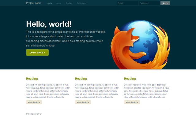
The same Solarized colors can be used to design a dark layout. Programmers are mostly familiar with this kind of color use in their IDE. It’s also a nice way to make your website stand out.
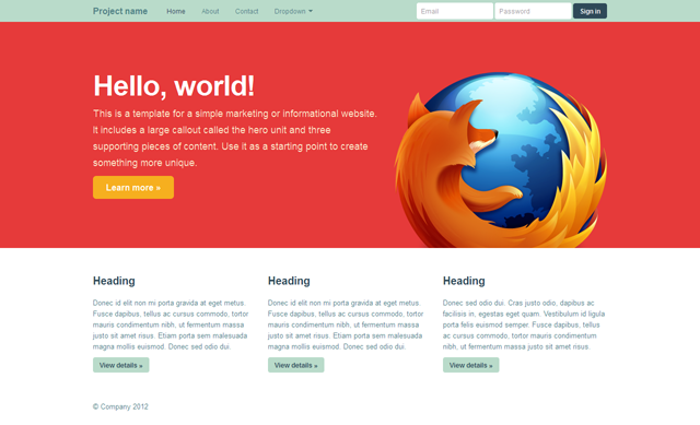
I talked about the app Paper and how it provided lovely color palettes too. The app is meant to draw sketches so the colors aren’t exactly supposed to fit together in terms of contrast and text readibility but still, it’s fun to play around with. I used the red color as the main background. It’s a bold decision, especially for a programmer, to use such a saturated color as the dominant color, but I like websites with a well-defined identity.
As I said earlier, if there’s a color palette you like, try to use it. There was this Nike ad that I really liked. It’s full of different colors and gradients, but I just picked a few of them and created a 8-color palette out of it.
A designer’s take at a programmer’s problem
I’m not a programmer but I tried to think like one in writing this article. I wanted to point out how easy it was to come up with a decent website just by quickly tweaking a Bootstrap template. I’ve often come across articles about programming that were aimed at designers, so I tried to do the opposite. If you have any question or remark, feel free to contact me. Any kind of feedback is appreciated.